How it works
Install your Child Theme
In order to make sure you get the best experience possible with Kayden, we recommend you follow these 4 simple steps.
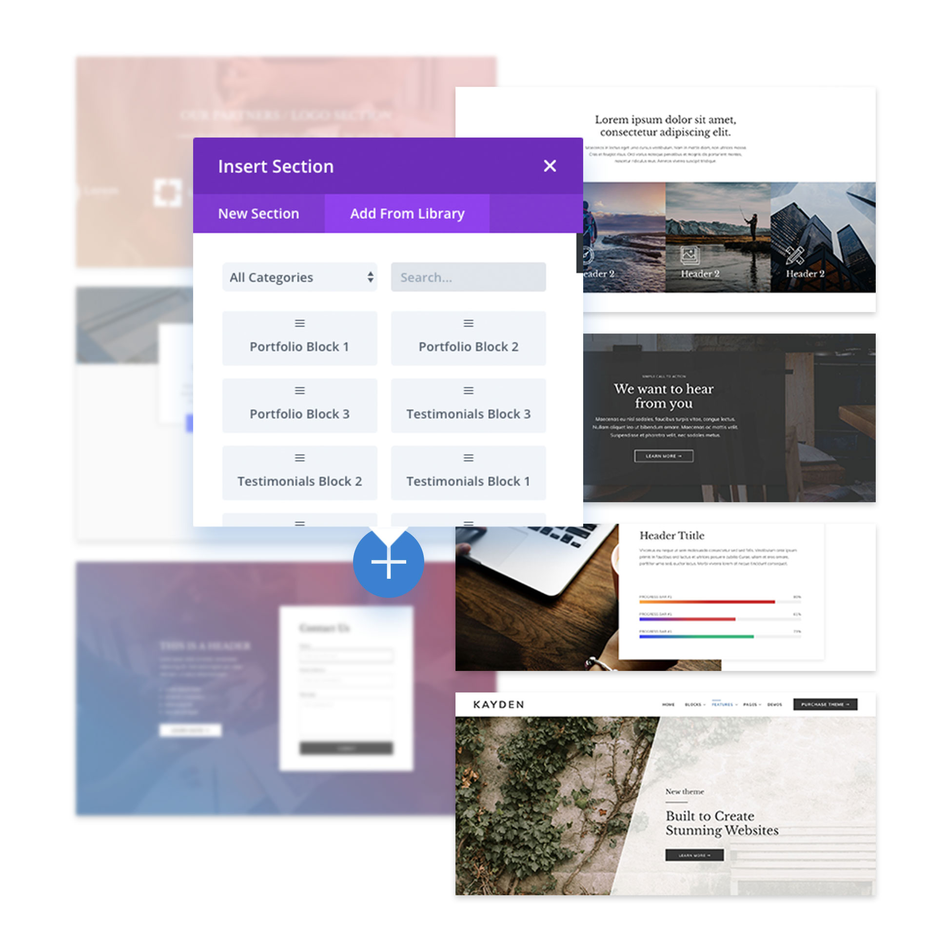
To use Blocks
If you already have a wireframe, or you want to jump-in to building your site, follow these steps:
- Edit Curent Homepage activating visual builder
- Delete the current sections
- Click on blue dot to add an object
- Go to “add from library”
- Search for the block you like
- Add it to your page
- Enjoy Customizing it!
Use Layouts
We offer Homepage Layouts that you can easely activate them to be as main page, following next steps:
- Choose which Layout fits best to you
- Go to WordPress Dashboard
- Go to Settings > Reading
- Change Homepage to the page you want
- Go to Page and edit the new homepage
- Enjoy Customizing It!
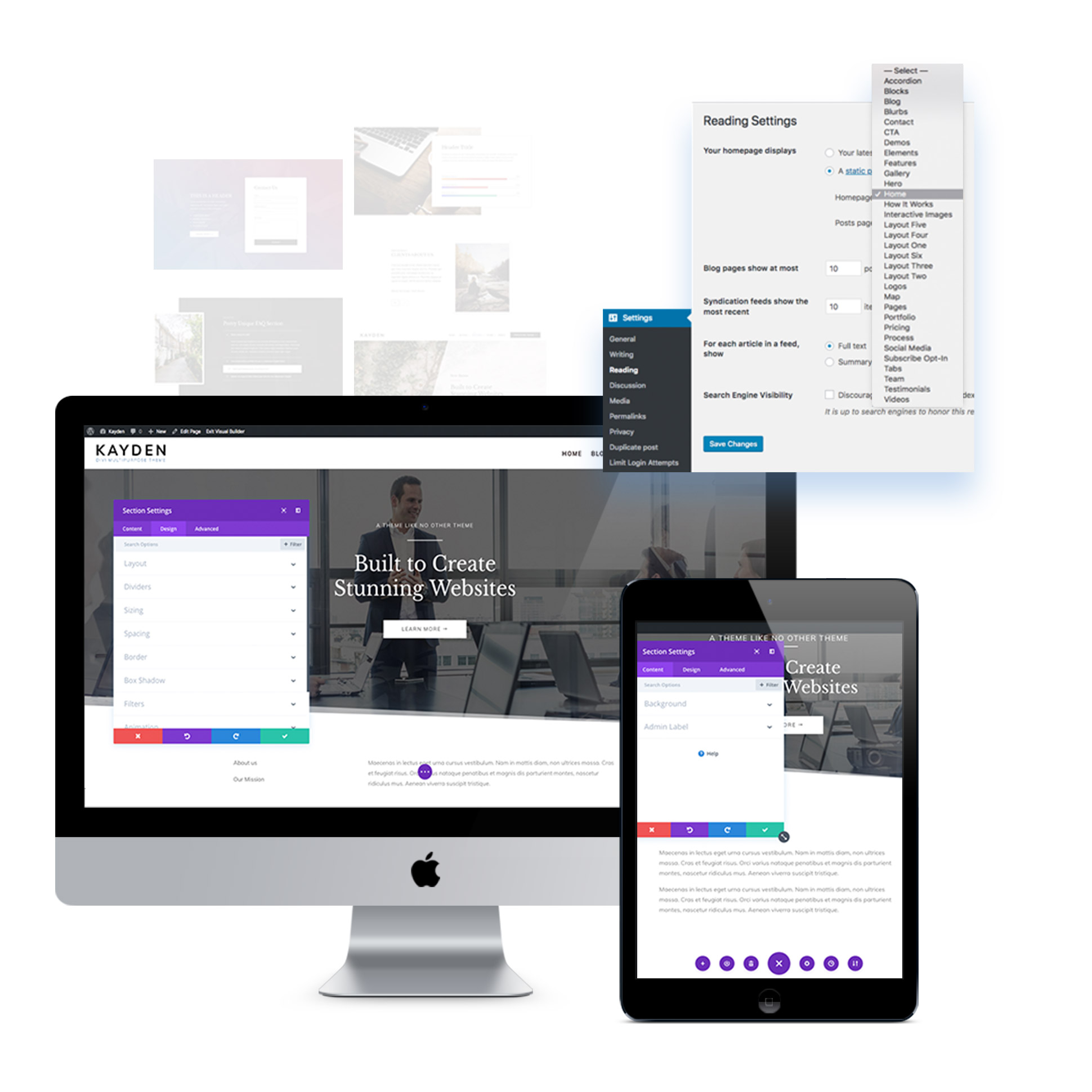
How to use blocks?
There are multiple ways to use blocks. What we’re going to show you is a way that makes sure the blocks work at their best. Because Divi uses a lot of JavaScript and custom css some modules may look wierd in Visual Builder, so don’t freak out, it might be just in there.
Build Your Wireframe
Pick Perfect Suited Blocks
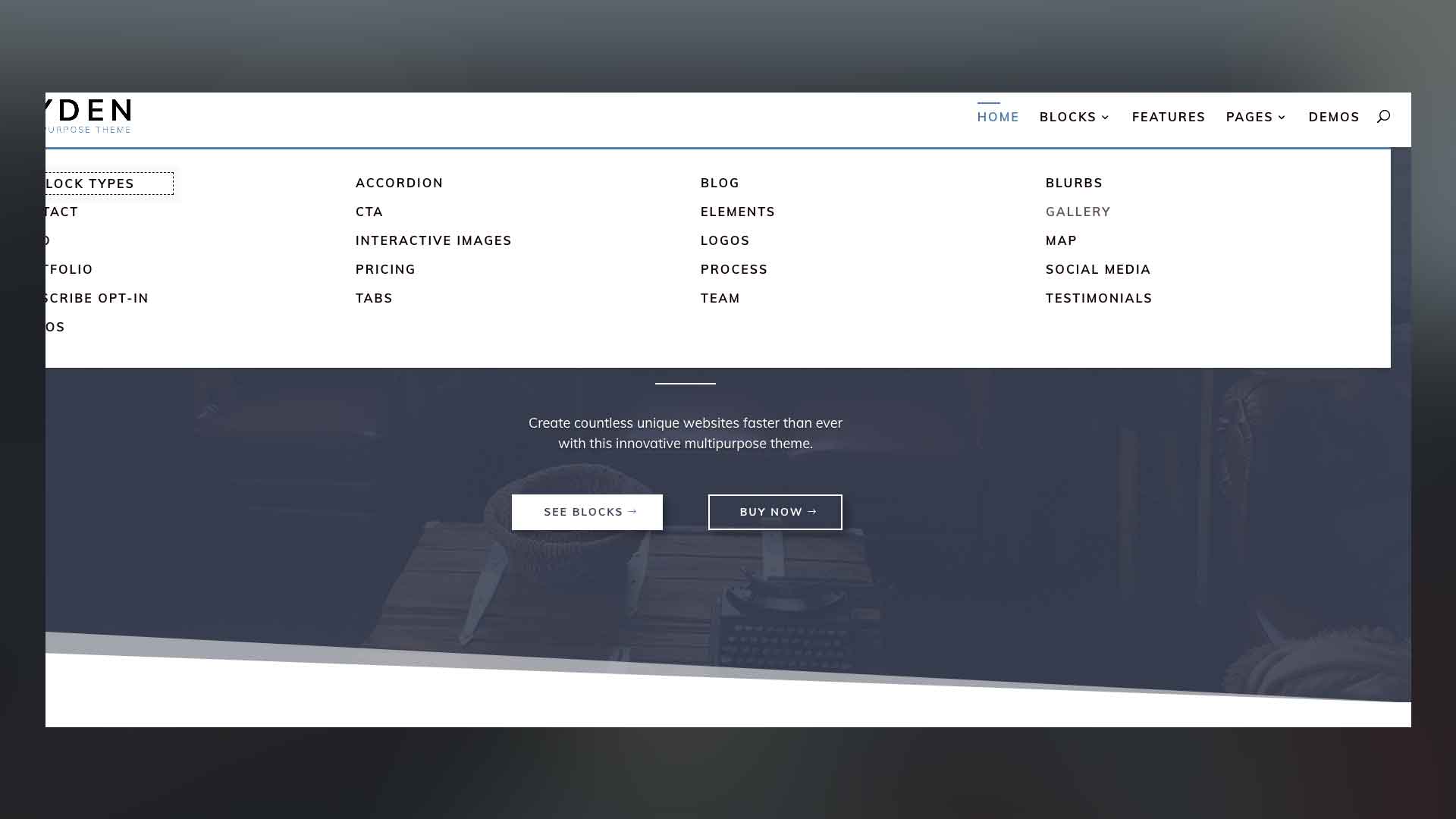
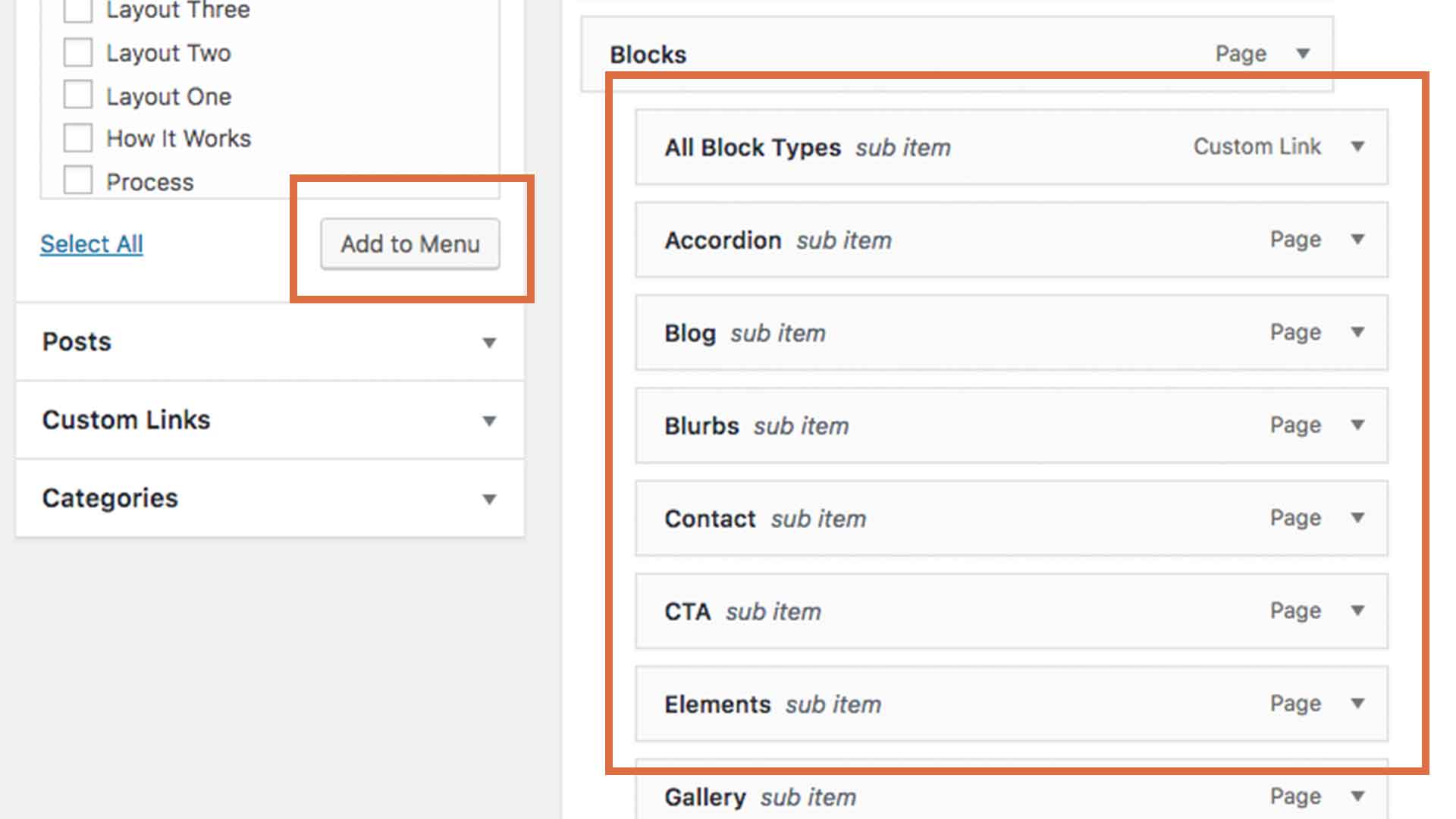
In order to make your searching easier we provide a full experience of each of the blocks in the Blocks Page or you can use the PDF we offer called All Blocks – Kayden.pdf
Start Building
Once you have a clear idea about the blocks you will use, it’s time to get them together. Follow the next 4 steps and you will get exactly what you worked for:
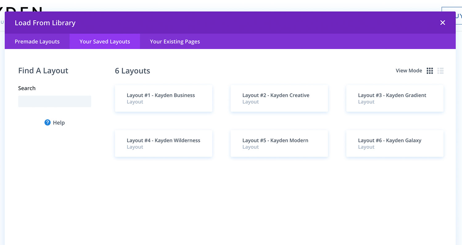
1. Create a new page
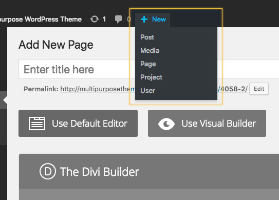
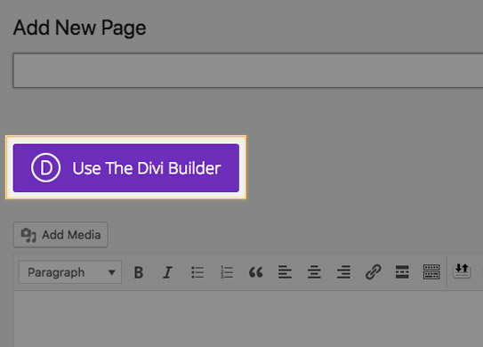
2. Use The Divi Builder
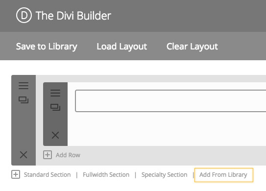
3. Click on Add from Library
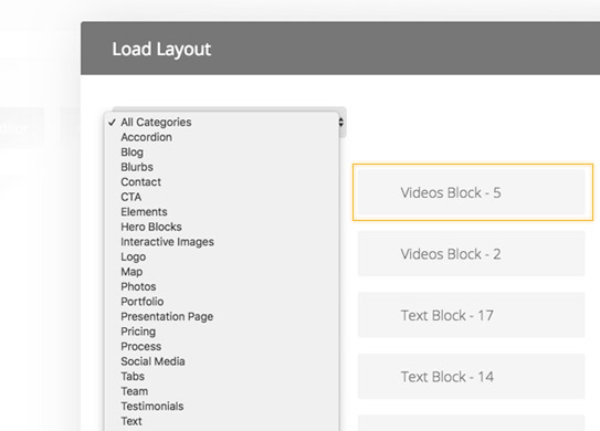
4. Insert Blocks to your page
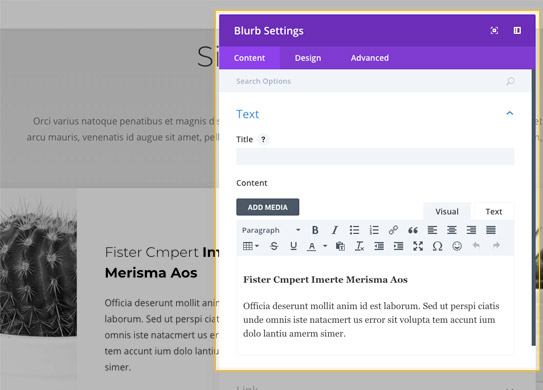
Customize each block
You can do the customization in Divi Builder or in Visual Divi Builder. Both Builders are working very well and elements are fully compatible.
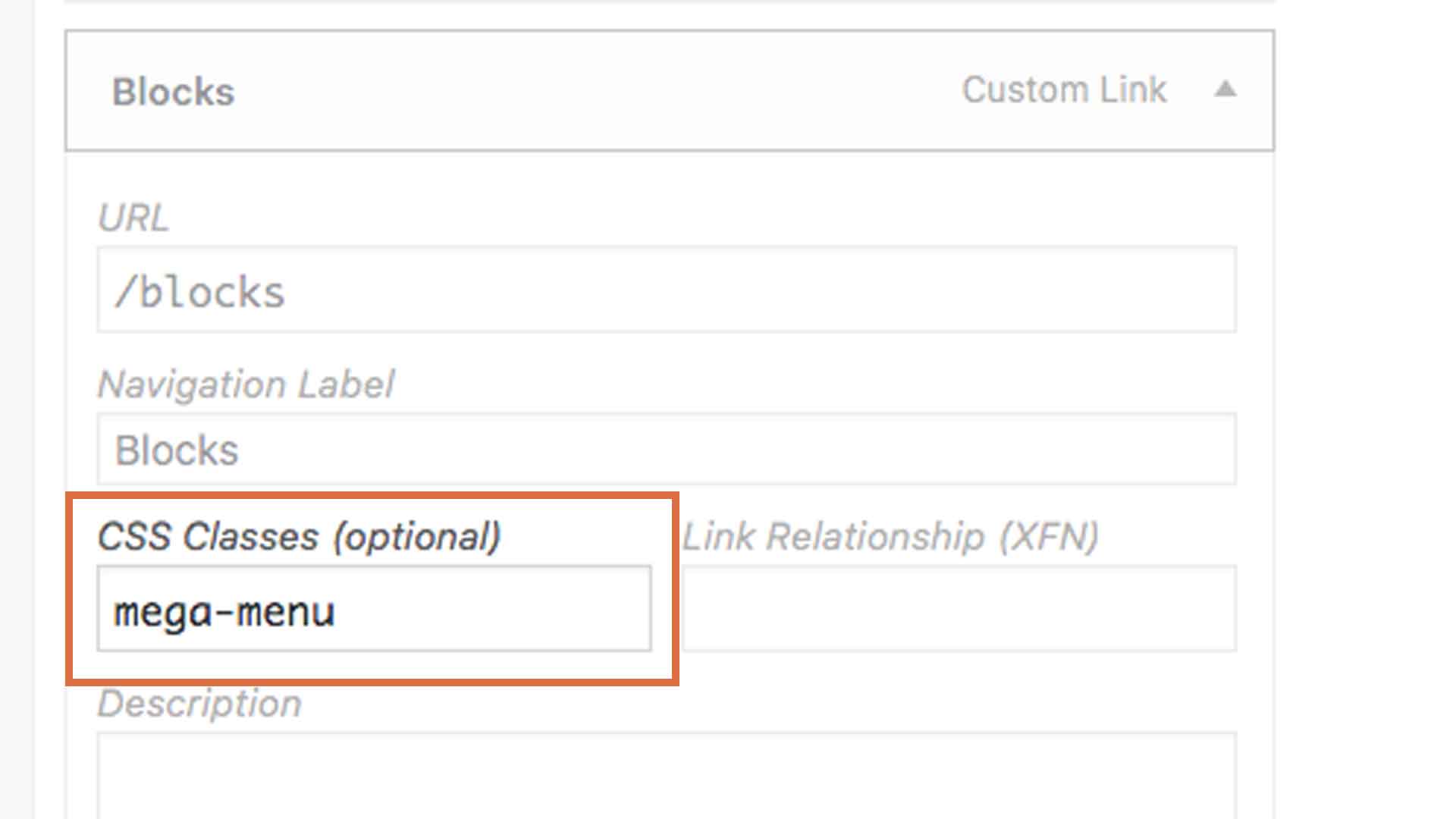
What Custom CSS Classes are we using?
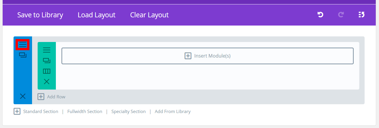
1. Go to the Sections, Row or Module Settings
2. Go to Advanced Tab
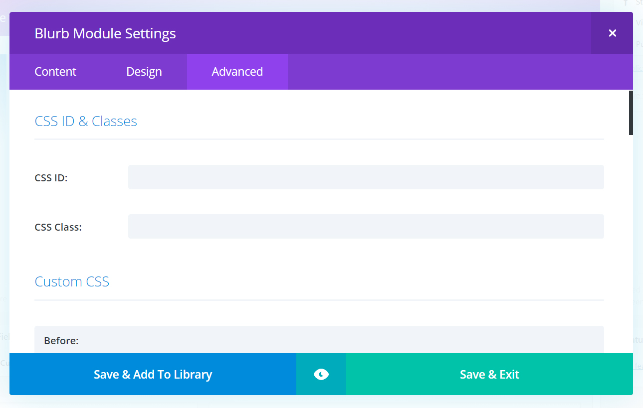
Here are the classes for Accordion Blocks, you need to add them in the Accordion MODULE SETTINGS:
- accordion1
- accordion2
except for this one which you need to have in the SECTION SETTINGS:
- accordion3
Here are the classes for Blog Blocks, you need to have them in the Blog MODULE SETTINGS:
- blog1
- blog2
- blog3
Here are the classes for Blurbs Blocks, you need to have them in the ROW SETTINGS:
- blurb1
- blurb2
- blurb3
Here are the classes for Contact Blocks, you need to have them in the Contact Form MODULE SETTINGS:
- contact1
- contact2
- contact3
Here are the classes for CTA Blocks, you need to have them in the SECTION SETTINGS:
- cta1
except for this one which you need to have in the ROW SETTINGS:
- cta2
Here are the classes for Elements Blocks, you need to add them in the ROW SETTINGS:
- counter1
- counter2
- counter3
except for these which you need to have in the SECTION SETTINGS:
- countdown1
- circle1
- gallery1
- gallery2
except for this one which you need to have in the SECTION SETTINGS:
- gallery3
Here are the classes for Hero Blocks, you need to have them in the SECTION SETTINGS:
- hero_section1
- hero_section2
- hero_section3
Here are the classes for Interactive Image Blocks, you need to add them in the ROW SETTINGS:
- interactive_images1
- interactive_images2
- interactive_images3
Here are the classes for Logos Blocks, you need to have them in the ROW SETTINGS:
- logos1
- logos2
- logos3
Here are the classes for Map Blocks, you need to have them in the Map MODULE SETTINGS:
- map2
- map3
Here are the classes for Portfolio Blocks, you need to have them in the Portfolio MODULE SETTINGS:
- portfolio1
- portfolio2
- portfolio3
Here are the classes for Pricing Blocks, to have in the Pricing MODULE SETTINGS:
- pricing1
- pricing2
- pricing3
Here are the classes for Process Blocks, you need to have them in the ROW SETTINGS:
- process1
- process2
- process3
Here are the classes for Social Media Blocks, you need to have them in the Social Media Follow MODULE SETTINGS:
- social_media1
- social_media2
- social_media3
Here are the classes for Subscribe Opt-In Blocks, you need to have them in the Email Opt-In MODULE SETTINGS:
- subscribe1
- subscribe2
- subscribe3
Here are the classes for Tabs Blocks, you need to have them in the Tabs MODULE SETTINGS:
- tabs1
- tabs3
except for this one which you need to have in the SECTION SETTINGS:
- tabs2
Here are the classes for Team Blocks, you need to have them in the ROW SETTINGS:
- team1
- team2
- team3
Here are the classes for Testimonials Blocks, you need to have them in the ROW SETTINGS:
- testimonials2
- testimonials3
except for this one which you need to have in the SLIDER MODULE SETTINGS:
- testimonials1
Here are the classes for Videos Blocks, you need to have them in the Image Module SETTINGS together with the video_popup class:
- video1
- video2
- video3
How to change fonts and colors from the theme?
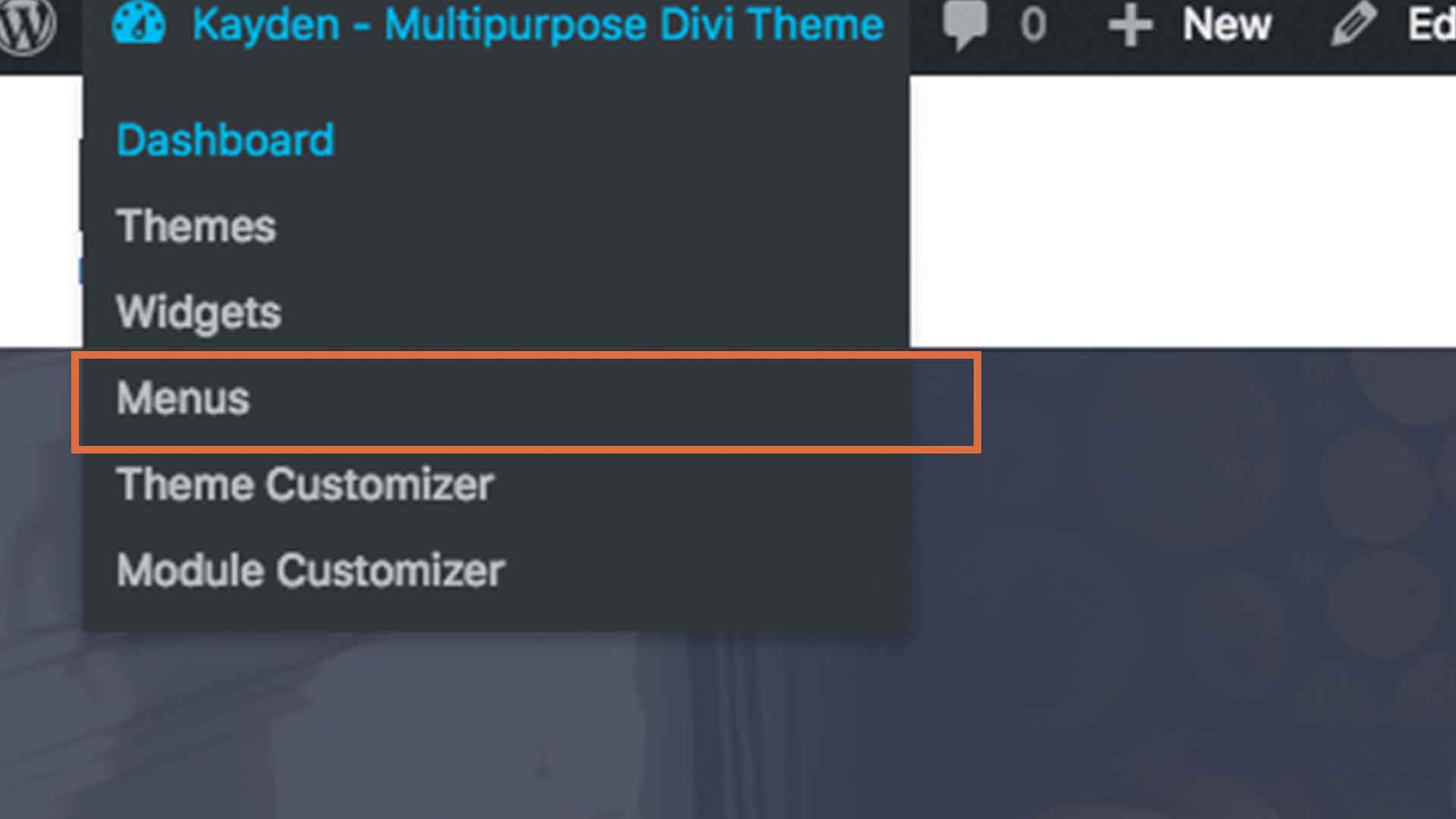
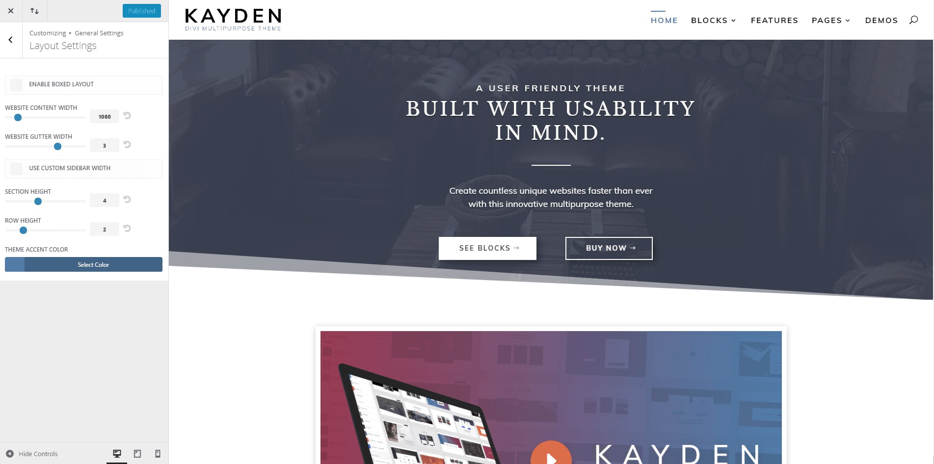
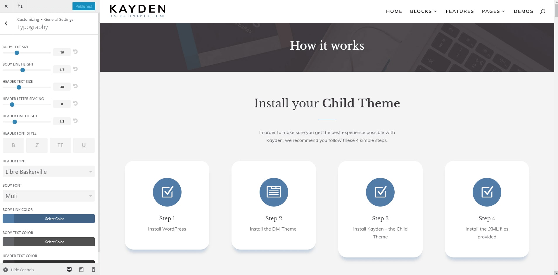
To change fonts and colors, you need to go to Divi on left side in the WordPress Dashboard and go to Theme Customizer -> General Settings.
In Layout Settings you can change the Theme Accent Color. This setting will change the colors on some backgrounds and icon colors as well.
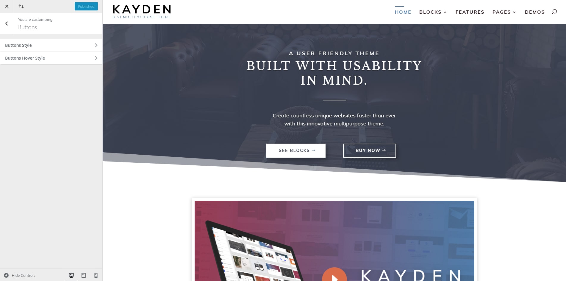
In the Buttons section, choose one of sections you want to customize. If you want to customize the default state, customize from the section Buttons Style; if you want to customize the hover state, you have to customize it from Buttons Hover Style. Here you can change the colors of all buttons that are defined as default.
In the Theme Customizer are some other sections as well, where you can define colors and other styles. We recommend you go through them all and customize it the way you want. After you finish with the Theme Customizer, there will be a few elements that have colors or other attributes defined inline, you need to go through each page and change each element you want to suit your chosen color scheme.
Lastly, there are a few CSS rules that might need to be looked at as well, we recommend you go in the WordPress Dashboard -> Divi -> Custom CSS and add any custom CSS in there.
How to customize a Layout?
Changing Icons
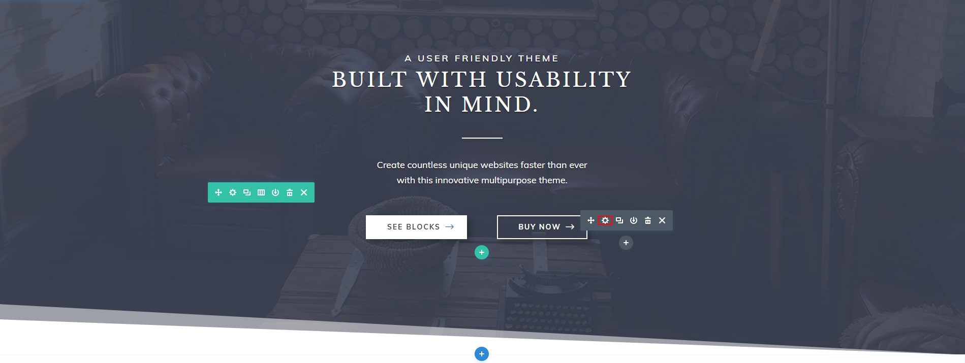
1. Enable Visual Builder on the page and find the icon you want to change. For icons, we recommend you use SVG icons. You can upload your SVG files in the Media Library and theme have integrated a function that transform those SVG in real SVG elements on the live site. This is done with the use of the svg_icon class that needs to be applied to all elements that contain and SVG file that you want to access through CSS on the front-end. After this you can change the svg’s properties using CSS.
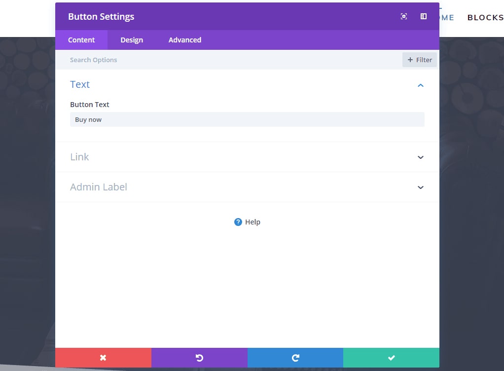
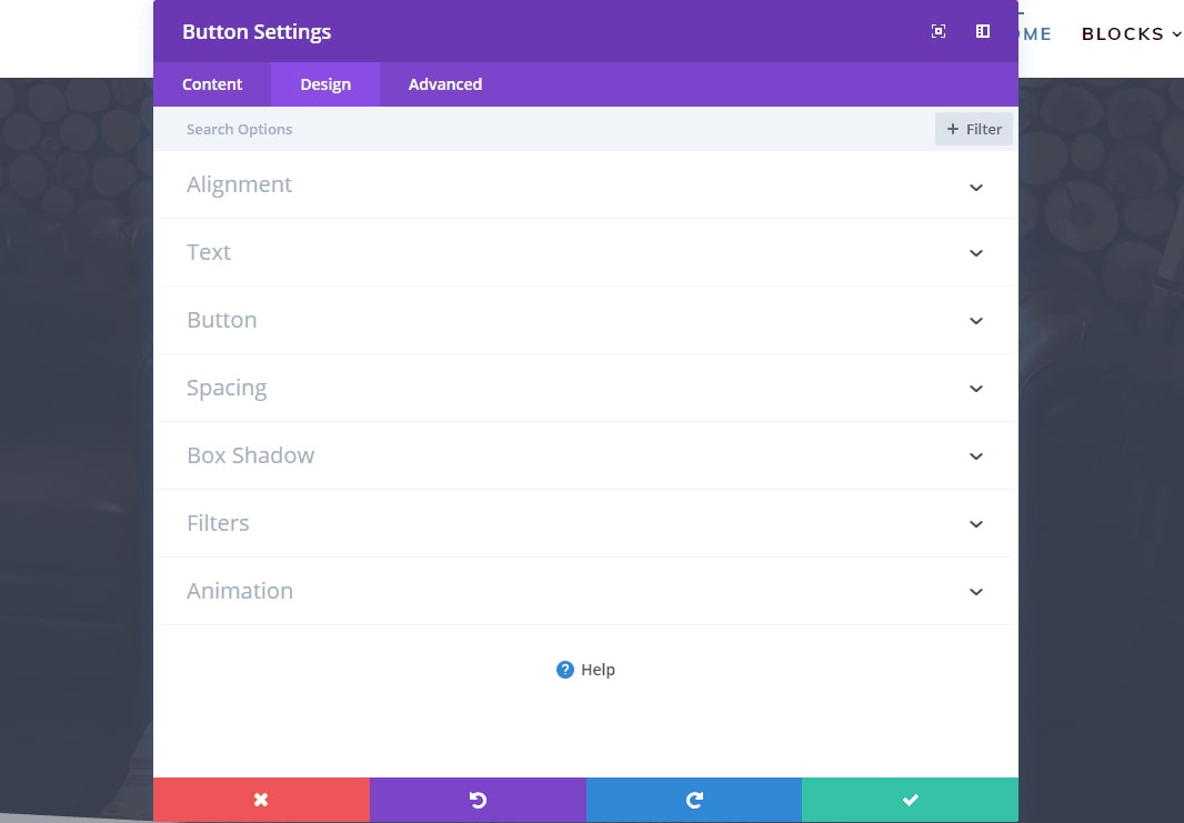
2. After you click on settings, you will see there a popup for blurb settings. If you scroll down, you will see the Image & Icon section, click there an you can switch between using an icon or an image. If you choose to use an image, you have to add it in the Media Gallery and select it there or if you want to use icon, you have to choose an icon from the Elegant Themes Icons that come with Divi.
Changing Image
1. Enable Visual Builder and find the Image you want to change.
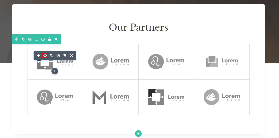
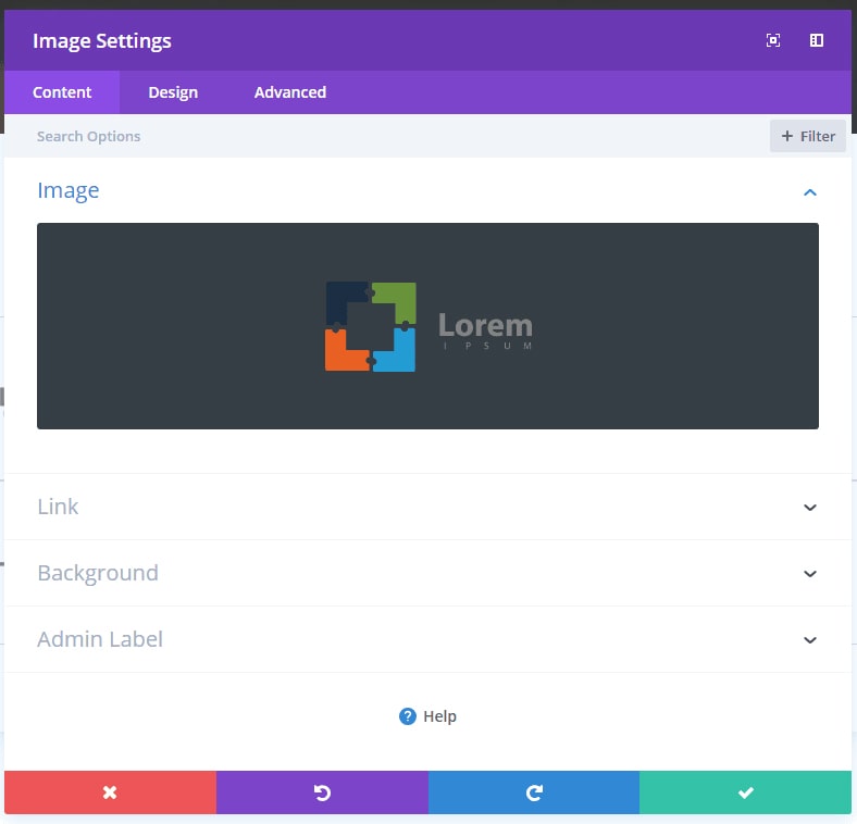
2. After you click on settings, you will see a popup for image settings. Click on the Image in that section, and you’ll be prompted to upload or to choose an image from the Media Gallery.
Changing Background
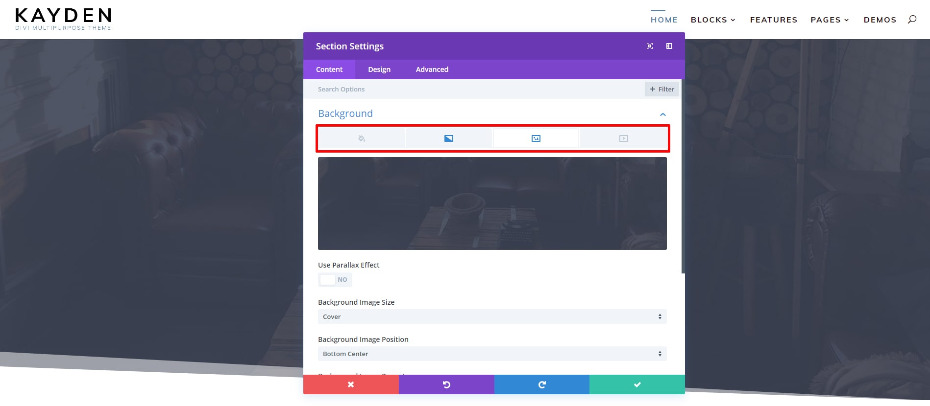
1. Enable Visual Builder and find section you want to change it background.
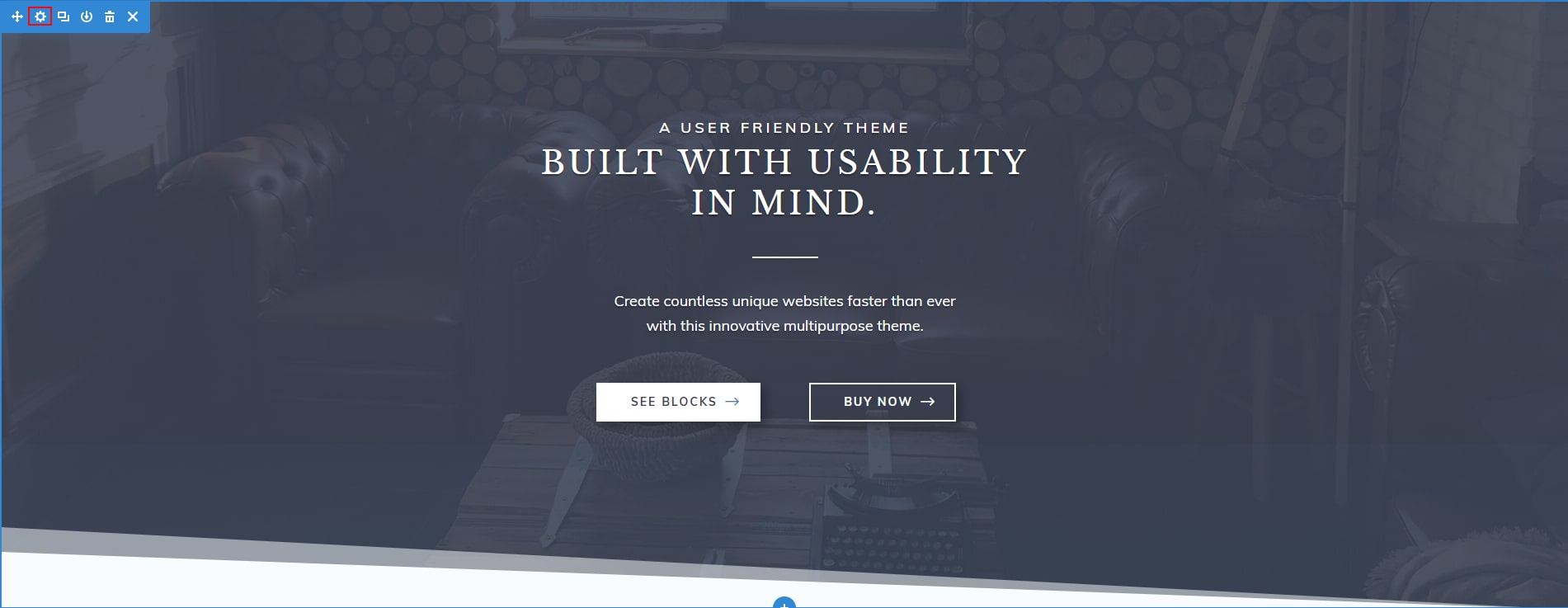
2. After you click on section settings, you will see a popup for section settings. There you can find the Background section. You can choose from there 4 types of background. Choose one of them, Color Background, Gradient Background, Image Background or Video Background, and choose a color or the resources you want. Under that you’ll have some other options you can customize.
What Sizes are the photos we use?
For full-width background we recommend minimum 1920px width. If you use icons in png format and want them to look good on retina displays we recommend you export them at double their size and show them at half their width.
